'/%3e%3cdefs%3e%3clinearGradient%20id='paint0_linear_2851_453'%20x1='31.999'%20y1='0.340833'%20x2='31.999'%20y2='64.2663'%20gradientUnits='userSpaceOnUse'%3e%3cstop%20stop-color='%23FF897E'/%3e%3cstop%20offset='1'%20stop-color='%23F06C60'/%3e%3c/linearGradient%3e%3c/defs%3e%3c/svg%3e)


1
Sir_Lazz·1 day ago🥇
NewIII approved
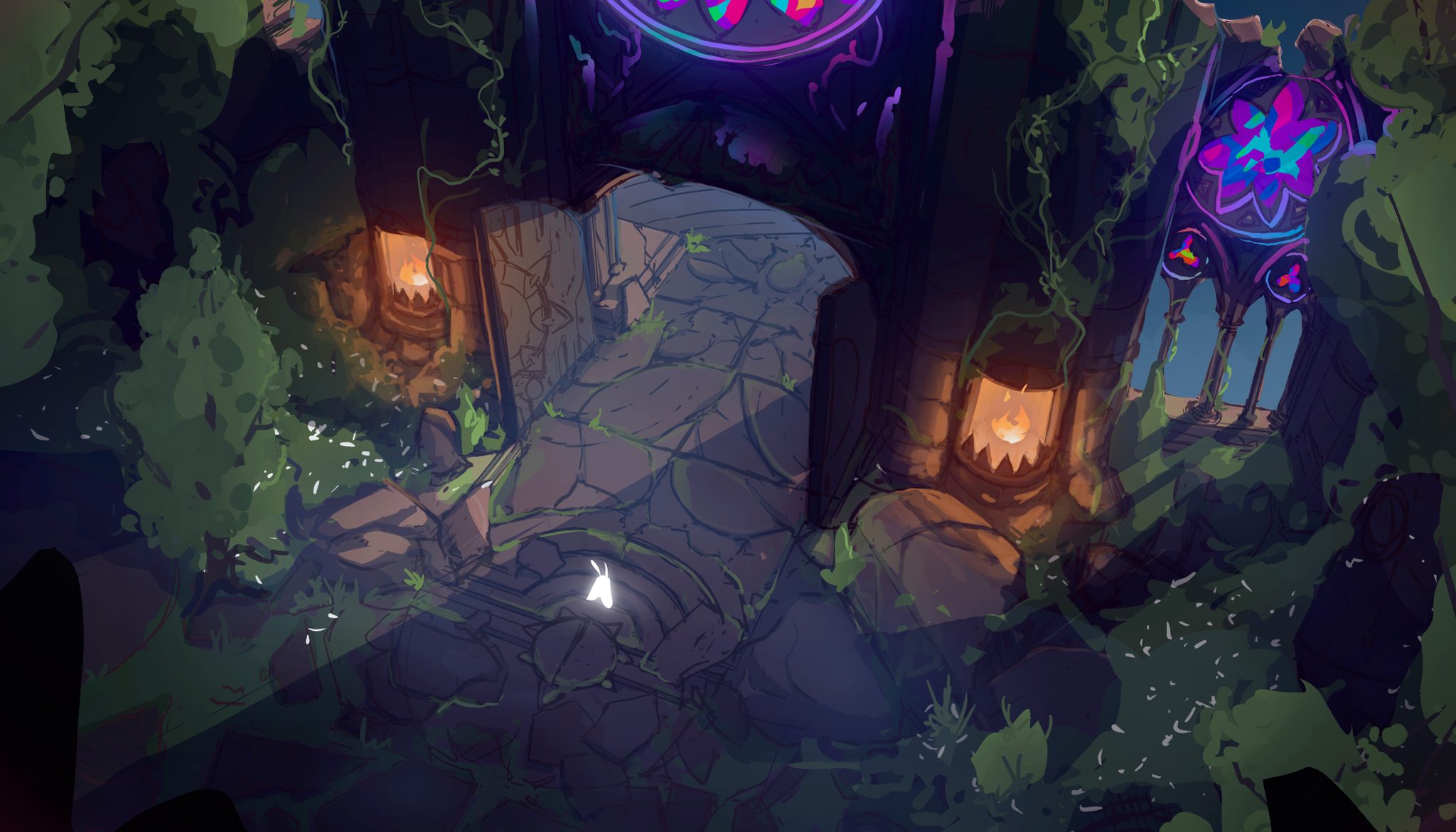
the whole piece is beautiful ! My main point of gripe is the stained glass: it's beautiful but as it stands, it's too big of an eyecatcher. It's too bright, too saturated, and it's using colors that aren't found anywhere else on the illustration. So, you end up with something that takes all the attention ! And it's a shame, cause with the white little guy and the flames, you had a nice balance to keep the eye in the center frame. maybe just color correct them a bit ?
1